|
|
Post by Neon Rosell II on Apr 30, 2008 16:34:40 GMT
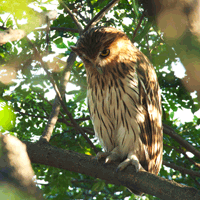
Excellent catch of the flier, Neon! Looks like you had too much morning coffee on the first one, but great job in catching it in mid-call. ;D ;D ;D Bwahahahah!!  to tell you the truth, maybe I did drink too much coffee  No, My day starts at midnight and I was just trying to save this photo and probably over did the USM to retrieve some details. I used a massive 300%, 10 radius, 1 threshold on this one.  Here are the original and the processed photos side by side. Please comment on what you find not pleasing on the PPed photo. I guess the over sharpening is the main one ;D Buzzing Flowerpecker (Dicaeum hypoleucum) - Quezon National Park, Atimonan, Quezon, March 21, 2008 40D + 300mm L f4 IS, + 1.4x Kenko TC, f5.6, 1/60 sec, ISO 640, Manual Exposure, Hand held, Raw Capture Original, Cropped and resized.............................................................................Post Processed 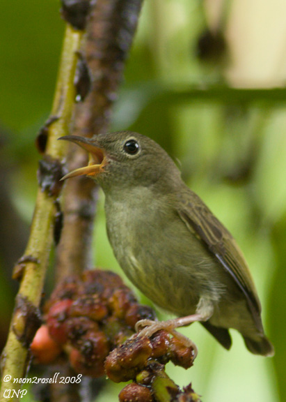 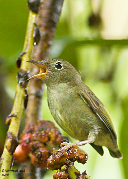 |
|
|
|
Post by Romy Ocon on Apr 30, 2008 23:09:49 GMT
When sharpening, try to imagine that you're a sculptor. You need large chisels for big details, and small chisels for fine details like hair/feather.
I think the USM radius used is too large, and it worsened the bit of shake in the capture (the unprocessed photo is not too bad as far as shake is concerned).
Try this one on a luminosity layer (two passes of USM):
1. USM 300, 0.6, 1
2. USM 300, 0.2, 1
When you make the layer alternately visible/invisible, you can easily see the effect.
|
|
|
|
Post by Neon Rosell II on May 1, 2008 0:05:43 GMT
When sharpening, try to imagine that you're a sculptor. You need large chisels for big details, and small chisels for fine details like hair/feather. I think the USM radius used is too large, and it worsened the bit of shake in the capture (the unprocessed photo is not too bad as far as shake is concerned). Try this one on a luminosity layer (two passes of USM): 1. USM 300, 0.6, 1 2. USM 300, 0.2, 1 When you make the layer alternately visible/invisible, you can easily see the effect. Wooohooo!! Thanks for this tip Master Romy!! Here is the same photo applied with the process you suggested. 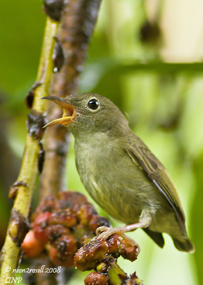 |
|
|
|
Post by Neon Rosell II on May 1, 2008 1:26:14 GMT
And here's the giant version...with USM applied as suggested. 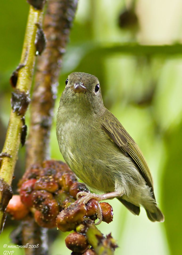 |
|
|
|
Post by mantarey on May 2, 2008 10:33:30 GMT
Wow, that Tip made a lot of difference. May I also take this opportunity to ask for some suggestions. Below is the untouched image of the Hornbill which I posted earlier. This is just cropped and converted from RAW to Jpeg. There is too much contrast beacuse of the white BG. What can be done with this image so it is worth printing. I hate looking at the white BG so we change it to blue but it gave the image an unnatural look. Is there a way to change the BG nicely?  Your suggestions will be highly appreciated. Thanks a lot. 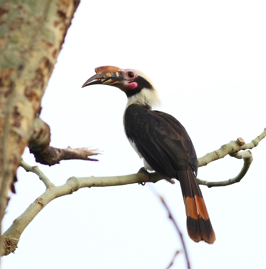 |
|
|
|
Post by Romy Ocon on May 2, 2008 12:00:32 GMT
Thanks for bringing out this topic, Rey.... let me share my personal thoughts on "how far is too far in processing bird photos."The following processing routines are "allowable" as far as my personal taste is concerned: 1. Exposure/WB correction 2. Cropping 3. Cloning out of minor things that are distracting, either in the BG or on the subject itself. 4. Sharpening 5. Local and global contrast adjustment 6. Levels adjustment 7. Noise reduction 8. Resizing Personally, I find that changing the BG to another color is "too far" and the same goes through with using blurring techniques to clean up any BG distraction. Such major alterations will turn the photograph into a "digital art" instead. There's really no hard and fast rule on this, except each one's personal taste, and more importantly the guidelines of the end user of the image. Note though that many nature publications (National Geographic is a prominent example) shy away from photos with too much alteration. That said, if your pic were my capture, I'd not change the BG, not mainly because of any concern with PP ethics, but more because of the fact that it's very tough to do so. It would take a very good PS artist with the eye of a master realist painter to pull it off, given the fine detail of the subject. Instead, I'd turn it into a "high-key" image, clone out some of the distracting elements, and re-crop to a more balanced composition. Here's my take with a quick 10-minute PP:  What I did: 1. Clone out the distracting branches 2. Use levels to bring out some shadow detail 3. Enhanced local contrast a bit via USM 5, 50, 1 4. Crop into a 4:5 aspect ratio (perhaps for an 8" x 10" print). Romy |
|
|
|
Post by Romy Ocon on May 2, 2008 12:43:45 GMT
And here's the giant version...with USM applied as suggested. Looks like you were able to control your excitement on this one, Neon..... no shake and amazing feather detail! ;D |
|
|
|
Post by mantarey on May 2, 2008 12:54:13 GMT
Wow, that's a lot better. Thanks a lot for taking the time to improve the image and share some of your techniques. Yes, I still remember your stand on what is acceptable PPing. I agree, and that is what I normally do. I just want to experiment on this one and find out if it can be done nicely, I really don't mind if it turns into digital art, the picture is one of the better one's I've taken so far and I thought I'll have it printed with a better BG color. For our regular posting, I would of course live within the "boundaries" that you mentioned. I hope we can have more of this kind of disccussions. Thank you very much. |
|