|
|
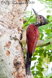
Post by Ely Teehankee on Jan 16, 2011 21:30:32 GMT
|
|
|
|
Post by Romy Ocon on Jan 17, 2011 23:13:54 GMT
Brightness on all generally look fine, Ely.
First and second pics appear a bit washed out and would seem to benefit from more contrast. Try a levels 10, 0.95, 240 on 1 and 15, 0.95, 255 on 2. See if you like the richer and contrastier colors.
|
|
|
|
Post by Ely Teehankee on Jan 18, 2011 12:21:55 GMT
Now I know what it means by wash out. Its like magic when I applied the levels. Thank you Romy. To start with the captures were not that much of a quality but now that it is PP, it is a lot better than I had hope for.   |
|