|
|
Post by Ely Teehankee on Jan 12, 2011 13:30:11 GMT
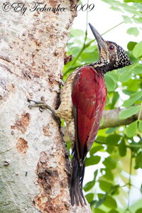
I change the location of my computer again and therefore calibrated it one more time. I think the picture looks good even if sometimes I can be hard on myself striving for that good picture that seems so near and yet cannot be reach. How does it appear on your monitor?  |
|
|
|
Post by Romy Ocon on Jan 12, 2011 22:29:32 GMT
Sharpening looks great, Ely! Brightness and contrast are good as well. As regards colors and casts, I can't help you much because of my color-blindness. I do feel that the colors as posted are a bit cold, hence I experimented on warming it up a bit. What I did:1. I created an adjustment layer for levels. 2. I used the gray point eyedropper of levels (middle one) to click on the lit portion (not on the shadow) of the white undertail. This reduced the intensity of the blues and increased that of the reds and greens. 3. The photo "warmed up" to my eyes, but I felt it could be overdone. 4. I reduced the opacity of the adjustment layer to 50% to reduce the "warming up" and that version is also posted below. 100% opacity of levels adjustment:  50% opacity of levels adjustment:  Originally posted version: Just check out yourself which version was nearest to the actual scene colors when you took the shot. |
|
|
|
Post by Ely Teehankee on Jan 13, 2011 1:09:17 GMT
Thank you Romy for acknowledging that sharpness, brightness, & contrast are okay. I do not like the warmness of the 100% opacity. I like the warmness of the 50% opacity. Is this a matter of personal taste or is the warmer version more the right rendition of how the bird actually looks like. When I compare it with the raw my original PP version comes closest to the raw. Your guidance on this matter would be much appreciated.
|
|
|
|
Post by Romy Ocon on Jan 13, 2011 2:12:47 GMT
Thank you Romy for acknowledging that sharpness, brightness, & contrast are okay. I do not like the warmness of the 100% opacity. I like the warmness of the 50% opacity. Is this a matter of personal taste or is the warmer version more the right rendition of how the bird actually looks like. When I compare it with the raw my original PP version comes closest to the raw. Your guidance on this matter would be much appreciated. Purple is a very tough color for the camera's auto WB algorithm to get well, as this color seldom occurs in many everyday scenes. I myself always run into WB trouble with this bird's plumage, particularly if it's in the shade or in overcast/cloudy light. On the other hand, most EOS bodies get the auto WB right with white birds in neutral sunlight (just after the morning golden light or just before the afternoon golden light). I wouldn't trust the camera's auto WB judgment in this case. Since your eyes aren't color-impaired, I suggest you trust the actual colors of the scene itself - set manually the WB according to your recollection of the scene. Was this converted in ACR? If so, what was the color temperature and tint values you used? From the EXIF data, you shot at a little past 8 am. Seeing that the dark and light plumage of the bird are not extremely contrasty (no burned whites and crushed shadows), I'd surmise that the skies were a bit overcast. For such lighting conditions, a color temp of 5000-6000 with a tint of 10-20 will be in the ball park. The choice of WB when converting in RAW is both a matter of personal taste and color fidelity/accuracy. If the difference in WB between my personal taste and that of another shooter's photo is small, I usually don't care - a good capture will always shine even with a slight color cast. Sometimes, the choice of WB is left to the end-user of the photo, e.g. a buyer who'll use it in a magazine or billboard. For such application, I sometimes let the buyer tell me his WB choice by submitting a middle-of-the-road WB version and soliciting his preference if he likes it as is, or instead warmer or colder. Another practice of most nature photogs is to err on the warmer side if unsure of the WB, as such warmers colors usually print better than colder ones. |
|
|
|
Post by Ely Teehankee on Jan 13, 2011 2:43:11 GMT
At the time the picture was taken the sun was shining on the bird at an angle so much so that it created a shadow on part of its back. The picture was taken at 8:15 and my white balance is set at 5300 with a tint of 29.
"The choice of WB when converting in RAW is both a matter of personal taste and color fidelity/accuracy. If the difference in WB between my personal taste and that of another shooter's photo is small, I usually don't care - a good capture will always shine even with a slight color cast." This remark perfectly answers my question.
Thank you very much Romy for giving me your expert opinion.
|
|
|
|
Post by Romy Ocon on Jan 13, 2011 3:15:10 GMT
At the time the picture was taken the sun was shining on the bird at an angle so much so that it created a shadow on part of its back. The picture was taken at 8:15 and my white balance is set at 5300 with a tint of 29. Thanks for the WB info, Ely. The tint of 29 toned down the strength of the greens. In RAW, try a WB of 5300 temp and a tint of 15-18.... this will strengthen the greens and tone down the blues. See if you like the results. |
|
|
|
Post by Ely Teehankee on Jan 13, 2011 11:04:34 GMT
I increased the WB temperature to 5500 and adjusted the tint to 18. You suggested warmer and I tried it and I like it. This is the new picture. Its incredible how you are so well verse with PP that you can find solutions to every situation. Thank you very much Romy.  |
|
|
|
Post by Romy Ocon on Jan 13, 2011 21:44:58 GMT
Looks great on my LCD, Ely!
|
|