|
|
Post by Ely Teehankee on Dec 21, 2010 22:12:39 GMT
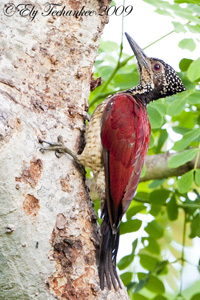
While the debate is going on whether it is a Little Egret or Chinese Egret, I would like to request for your opinion on how I can improve on the way I take and process my pictures. The first picture was taken earlier and at a further distance that I was able to fit in the whole bird. The second and third picture, I was too close to the bird and there was no way the bird could fit in as I could not move back at all. I just made the best out of the situation by taking the whole head minus the tail and the other one with the tail but shortened legs. I think I got the pictures right but that is from my point of view. I know you are an expert on bird photography and would like to hear what you have to say about it and if I can still improve, it would be much appreciated.    |
|
|
|
Post by Romy Ocon on Dec 22, 2010 1:11:10 GMT
Hi Ely,
First I must congratulate you for being able to get close to this bird and recording such astounding detail..... great birding work! Can't help on the ID though if it's a Little or a Chinese, as I'm clueless as well.
Now, let me point out some nits:
First Photo - Composition looks fine to me and detail is great. Something is odd with the colors - it's as if you used the shadows/highlights too aggressively. This resulted into haloes around the outline of the bird and flat, murky whites. The S/H tool is great in restoring detail in the highlights and exposing the shadows but it should be used with extreme care and in moderation.
Second Photo - Great detail and background on this one. Again I see the effect of the S/H tool here - haloing around the bird and murky whites. On the composition, the classic approach when some of the extremities are cut off is just to present a head shot, which can be done in this case by cropping to just include the head/neck and perhaps a small part of the shoulder. I'd also wish for more space in front and above the head.
Third Photo - Great detail and potentially great background on this one too. There's less haloing here, and the whites are much better. Not sure what happened to the color of the water in the BG though..... it looks unnatural to me. My suggested composition approach in the second photo also applies to this one.
I suggest less aggressive use of the highlights/shadows tool, Ely. This is causing some odd colors in many of your photos, which are captured so well.
|
|
|
|
Post by Ely Teehankee on Dec 22, 2010 3:04:28 GMT
Your critique confirms that I am taking better photographs now compared to before. I think the equipment like the lens and the camera is a big factor.
I totally agree with you as I use the shadows and highlights very aggressively. This is where I can improve on. I don't have any formal lesson on PP. Is there anywhere that charges reasonable where I could take lessons and learn how to do PP properly without taking the whole course?
Is there a way to backtrack what I have done like what are the numbers that I applied on the S/H, USM, etc. so that I can learn from my mistakes.
Thank you Romy for your Critique as it will definite help me know where I can make improvements.
|
|
|
|
Post by Romy Ocon on Dec 22, 2010 4:08:49 GMT
Ely, I think you got the capture part nailed already. You have practically mastered how to get excellent raw materials via good fieldcraft, great equipment and the passion to regularly go on sorties. Now, all you need is to do is bring your cooking technique (post processing) to the next level and convert such good ingredients to gourmet stuff. In my view, you need to address two concerns: 1. The first step is to have a good and properly calibrated display. I understand that you have the hardware (nice monitor + calibrator) and software (calibration program) already. I suspect though that your display and calibration systems are not yet optimized. Otherwise, you will readily notice the haloing and the off colors in some of the photos. Even if your PP skills are topnotch, if you are processing from an unoptimized display, you will churn out not-so-good results. Sure it will look good on your monitor, but off-looking in other people's display. I believe you have to address this concern first. 2. The second step, as you already know, is to get proper training in post processing, whether through self-teaching using online and book-based materials, enrolling in a PP course or engaging the services of a good tutor. I went through the self-taught route to save cost but it took a lot of effort and time.  |
|
|
|
Post by Ely Teehankee on Dec 22, 2010 7:20:04 GMT
I have just re calibrated my monitor. It seems to be brighter and clearer now but I need you to tell me if it is now optimized or not. I have re processed the first picture by minimizing the Highlights & Shadows. Is there any improvement or not?  I check on the third photo on why the background is like that. It is not the water but the background which is a barge that is colored blue and red. Here is a picture of a Collared Kingfisher taken at 27.4 meters and PP full frame.  This is a re processed picture of the original third picture and crop. This picture was taken at 15.8 meters with the barge as the background creating this strange looking Bokeh. I like the Bokeh as it solves the mystery of why its like that and it is unusual. The picture looks better to me but I would like to hear what you have to say.  |
|
|
|
Post by Romy Ocon on Dec 22, 2010 9:25:13 GMT
These are much better versions, Ely! Now, that explains the the odd color of the water in the last photo.
The first photo, while improved in the second version, is too heavily backlit to be saved as a frameable. Sometimes, the light just doesn't work well in our favor.
|
|
|
|
Post by Edu Lorenzo Jr on Dec 22, 2010 11:53:11 GMT
the last one deserves to be framed.
adminnote:Admin Note: Sorry, only the admin and the one requesting critique is allowed to post in this thread.
|
|
|
|
Post by Ely Teehankee on Dec 22, 2010 15:17:41 GMT
That is certainly calling a spade a spade. I like that. Thank you very much Romy.
|
|