|
|
Post by Romy Ocon on Jun 30, 2009 3:20:21 GMT
This is the first time I'm using Adobe RGB (aRGB) as a working space in processing. As everybody knows, aRGB has a wider gamut than sRGB, especially in the hot reds and greens. I tried the following workflow: 1. Convert in DPP to 16-bit TIFF, aRGB, contrast/brightness toned down to allow highlight head room during processing and conversion to sRGB later. 2. Process in PS using an aRGB working space. 3. Convert to sRGB after all processing is done (this is a necessary step if the photo is for web use, as the default color space of most browsers and web devices is sRGB). 4. Fine-tune levels, particularly the highlight side which moved during conversion form aRGB to the narrower gamut sRGB. Mountain White-eye ( Zosterops montanus) Elev. 2155 m ASL, Mt. Data, Bauko, Mountain Province, Nov. 6, 2006 20D + 500 f4 IS + Canon 1.4x TC, 700 mm, f/5.6, ISO 400, 1/320 sec, hand held, manual exposure in available light, near full frame, + 1.0 stop EC during conversion (previously unprocessed photo)  |
|
|
|
Post by Neon Rosell II on Jun 30, 2009 3:42:38 GMT
Hi Ka Mastah, beautiful capture as always!!  Would it be possible to get a side by side presentation of the two working space (sRGB and aRGB converted to sRGB) using the same work flow for both, on the same photo. In this way we can see the difference, cause this color thing is, I think, very subjective or differs from person to person. What are the reasons for using aRGB as your working space? Cheers, |
|
|
|
Post by Romy Ocon on Jun 30, 2009 4:04:09 GMT
Hi Ka Mastah, beautiful capture as always!! Would it be possible to get a side by side presentation of the two working space (sRGB and aRGB converted to sRGB) using the same work flow for both, on the same photo. In this way we can see the difference, cause this color thing is, I think, very subjective or differs from person to person. What are the reasons for using aRGB as your working space? Cheers, Well, aRGB has a wider color gamut than sRGB. This means hot reds, greens and blues (and the downstream combinations of these colors) can be output with higher color fidelity to suitable media (wide gamut monitors and papers). Pro applications like first class magazines, advertising and high-end prints use aRGB or the even wider gamut ProPhoto RGB. Let me come out with an analogy, say English words vocabulary. One can write a literary piece with sRGB (say 5,000 words vocabulary), aRGB (say 6000 words vocabulary), or ProPhoto RGB (say 7000 words vocabulary). When the literary piece is a simple one like a short essay, then sRGB might be perfectly suitable. But if one writes an ambitious novel with a wide range of flavors and emotions, a wider vocabulary results into a better, more accurately descriptive piece. However, wide gamut color space is tricky to use because most local printers and web applications are not color-managed. Hence, if one is yet unfamiliar with the strengths and weaknesses of each gamut, sRGB is safer to use. Here's the aRGB version saved in the original color space then uploaded to web. Non-color managed browsers will not be able to know that this is in aRGB, and will interpret the colors as sRGB (default web color space). This results into flat and less saturated colors.  I'm reposting the one converted to sRGB for convenient comparison: I haven't noted the exact steps of my processing, so I can't go back and replicate these with a pure sRGB working space from RAW conversion to finished product. You can easily try it though, choose photos with a lot of hot greens/reds/blues and their derivatives (BN Oriole or even the IBKF). |
|
|
|
Post by Mark Itol on Jun 30, 2009 7:37:16 GMT
Very nice work as always, Ka Mastah! And thanks for the sharing about color management.  I can see the difference of the two images when viewing in Google Chrome (first image looks flat color-wise), but not when viewing in Firefox (3.5), which supports color management. Still to try on IE. Edit: Looking more closely, the first image has slightly deeper greens and reds when viewed in Firefox. |
|
|
|
Post by Romy Ocon on Jun 30, 2009 10:17:00 GMT
Very nice work as always, Ka Mastah! And thanks for the sharing about color management. I can see the difference of the two images when viewing in Google Chrome (first image looks flat color-wise), but not when viewing in Firefox (3.5), which supports color management. Still to try on IE. Edit: Looking more closely, the first image has slightly deeper greens and reds when viewed in Firefox.Thanks, Mark. Yes, Mozilla Firefox is color aware, but IE is not (haven't used Google Chrome yet). Great that you see the deeper reds and greens of the aRGB one in Firefox! I actually processed the photos a bit on the dark side, as pushing it 1 stop in RAW conversion has started to produce noise. |
|
|
|
Post by Ely Teehankee on Jun 30, 2009 10:35:10 GMT
I think I am still in the 5000 word vocabulary. I have to get used to it before I take the next step. It would be better for us who are still in short pants if you could give us something we can work with. Nevertheless, thank you for sharing your knowledge with us.
|
|
|
|
Post by Neon Rosell II on Jun 30, 2009 13:40:18 GMT
Thanks for sharing your knowledge again, Ka Mastah!! Yeah, the aRGB photo is flat on my screen and looks like it lacks saturation. I guess I'll just stick with sRGB for the time being since I don't have the equipment that will view and use aRGB properly. ;D But surely I'll try it someday when the need arises.  |
|
|
|
Post by Teddy Regpala on Jun 30, 2009 17:35:23 GMT
Romy, I remember your post way back then advising just use sRGB. That's the time I switched back to sRGB. But I know there must be some benefit using aRGB, so I switched back to it earlier this year. But the thing is, my monitor is not properly calibrated yet. Just relying on visual tests that can be subjective, and being partially color-blind (too) I'm not seeing much difference. My question is, what's your preferred sRGB conversion method, perceptual, absolute colorimetric, media-relative colorimetric, etc? Thanks Mastah!  |
|
|
|
Post by Romy Ocon on Jun 30, 2009 23:36:46 GMT
Romy, I remember your post way back then advising just use sRGB. That's the time I switched back to sRGB. But I know there must be some benefit using aRGB, so I switched back to it earlier this year. But the thing is, my monitor is not properly calibrated yet. Just relying on visual tests that can be subjective, and being partially color-blind (too) I'm not seeing much difference. My question is, what's your preferred sRGB conversion method, perceptual, absolute colorimetric, media-relative colorimetric, etc? Thanks Mastah! Good questions, Ted! I use Perceptual as default, except when the photo has a lot of highlights then I switch to Relative Colorimetric. Sometimes, I switch back and forth between the two and just choose which rendering suits my taste at the moment. I also use the default Adobe conversion engine and Black Point Compensation. To expound on the terms further, I pasted below the relevant sections of the Help Menu of PS. About rendering intents A rendering intent determines how a color management system handles color conversion from one color space to another. Different rendering intents use different rules to determine how the source colors are adjusted; for example, colors that fall inside the destination gamut may remain unchanged, or they may be adjusted to preserve the original range of visual relationships when translated to a smaller destination gamut. The result of choosing a rendering intent depends on the graphical content of documents and on the profiles used to specify color spaces. Some profiles produce identical results for different rendering intents.
In general, it is best to use the default rendering intent for the selected color setting, which has been tested by Adobe Systems to meet industry standards. For example, if you choose a color setting for North America or Europe, the default rendering intent is Relative Colorimetric. If you choose a color setting for Japan, the default rendering intent is Perceptual.
You can select a rendering intent when you set color conversion options for the color management system, soft-proof colors, and print artwork:
Perceptual - Aims to preserve the visual relationship between colors so it’s perceived as natural to the human eye, even though the color values themselves may change. This intent is suitable for photographic images with lots of out-of-gamut colors. This is the standard rendering intent for the Japanese printing industry.
Saturation - Tries to produce vivid colors in an image at the expense of color accuracy. This rendering intent is suitable for business graphics like graphs or charts, where bright saturated colors are more important than the exact relationship between colors.
Relative Colorimetric - Compares the extreme highlight of the source color space to that of the destination color space and shifts all colors accordingly. Out-of-gamut colors are shifted to the closest reproducible color in the destination color space. Relative Colorimetric preserves more of the original colors in an image than Perceptual. This is the standard rendering intent for printing in North America and Europe.
Absolute Colorimetric - Leaves colors that fall inside the destination gamut unchanged. Out-of-gamut colors are clipped. No scaling of colors to destination white point is performed. This intent aims to maintain color accuracy at the expense of preserving relationships between colors and is suitable for proofing to simulate the output of a particular device. This intent is particularly useful for previewing how paper color affects printed colors.
Color conversion options
Color conversion options let you control how the application handles the colors in a document as it moves from one color space to another. Changing these options is recommended only if you are knowledgeable about color management and very confident about the changes you make. To display conversion options, choose Edit > Color Settings, and select Advanced Mode (Illustrator and InDesign) or More Options (Photoshop). In Acrobat, select the Color Management category of the Preferences dialog box.
Engine -Specifies the Color Management Module (CMM) used to map the gamut of one color space to the gamut of another. For most users, the default Adobe (ACE) engine fulfills all conversion needs.
To view a description of an engine or intent option, select the option and then position the pointer over the option name. The description appears at the bottom of the dialog box.
Intent (Photoshop, Illustrator, InDesign) - Specifies the rendering intent used to translate one color space to another. Differences between rendering intents are apparent only when you print a document or convert it to a different working space.
Use Black Point Compensation - Ensures that the shadow detail in the image is preserved by simulating the full dynamic range of the output device. Select this option if you plan to use black point compensation when printing (which is recommended in most situations).
Use Dither (Photoshop) - Controls whether to dither colors when converting 8 bit-per-channel images between color spaces. When the Use Dither option is selected, Photoshop mixes colors in the destination color space to simulate a missing color that existed in the source space. Although dithering helps to reduce the blocky or banded appearance of an image, it may also result in larger file sizes when images are compressed for web use.
adminnote: Admin Note: Seems this thread has developed into a good technical discussion, so I'm transferring it to the proper board for easier search reference in the future. |
|
|
|
Post by gabriel buluran on Jul 1, 2009 2:06:08 GMT
These are great learning materials. My question is:
There is an aRGB and sRGB setting in my camera. I set it in sRGB as advised by a friend before. Supposedly this is the "safer" setting as not all print services offer aRGB. Is that suggestion right?
Would I still be able to render picture taken in sRGB to aRGB at post processing?
I am not sure if I'm making sense...
Thanks in advance...
|
|
|
|
Post by Romy Ocon on Jul 1, 2009 3:00:58 GMT
These are great learning materials. My question is: There is an aRGB and sRGB setting in my camera. I set it in sRGB as advised by a friend before. Supposedly this is the "safer" setting as not all print services offer aRGB. Is that suggestion right? Would I still be able to render picture taken in sRGB to aRGB at post processing? I am not sure if I'm making sense... Thanks in advance... Gabs, if you're shooting RAW or NEF or DNG, it doesn't matter which color space is set in-camera. You can set/finalize the color space during RAW conversion. The in-camera color space works only on jpegs straight from the camera. I agree with the suggestion of your friend to leave it at sRGB to simplify things. If you shoot in RAW, you can reset this to aRGB during conversion for applications that need a wider gamut. |
|
|
|
Post by gabriel buluran on Jul 1, 2009 5:25:30 GMT
Thanks Romy!!! I do shoot in RAW. Now I would just have to be mindful during the conversion from raw to jpeg.
Looking forward to birding soonest.
|
|
|
|
Post by ppaaoolloo on Jul 1, 2009 9:38:56 GMT
Do you need to enable color management in FF3.5 or is it ON by default?
|
|
|
|
Post by Romy Ocon on Jul 1, 2009 9:50:12 GMT
|
|
|
|
Post by Mark Itol on Jul 1, 2009 10:33:45 GMT
I haven't tried the add-on posted by Ka Mastah, but as far as I know, it's turned on by default in 3.5 (I think it was off by default in 3.0 and you have to enable it via about:config). I think the add-on is to allow easier access to color management options. |
|
|
|
Post by Romy Ocon on Jul 1, 2009 14:27:14 GMT
I haven't tried the add-on posted by Ka Mastah, but as far as I know, it's turned on by default in 3.5 (I think it was off by default in 3.0 and you have to enable it via about:config). I think the add-on is to allow easier access to color management options. I'm using FF 3.0.11, and it was not color-managed till I added the add-on (perhaps I didn't set it properly before?). |
|
|
|
Post by Teddy Regpala on Jul 1, 2009 18:00:34 GMT
I turned color management on for FF 3.0.xx. It can even handle ICC V4. Last night, I upgraded to FF 3.5 ... unfortunately, it can't handle ICC V4 profiles yet (just V2), so it's like a downgrade. Bummer! Anyway, there's not a lot of images on the web with ICC V4 profile that I know of, so I'll just patiently wait for the next upgrade. To test your browser: color.org/version4html.xalter |
|
|
|
Post by Romy Ocon on Jul 2, 2009 1:19:13 GMT
Reposting in this thread my latest update in the Philips 24" LCD user report: ________________________________________________ Just for fun, I mapped out some graphs to compare the color gamut of the calibrated Philips 240PW9EB to various gamuts: 1. Vs. Adobe RGB (Philips 240PW9EB is a hair wider)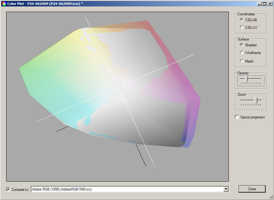 2. Vs. sRGB (Philips 240PW9EB is much wider)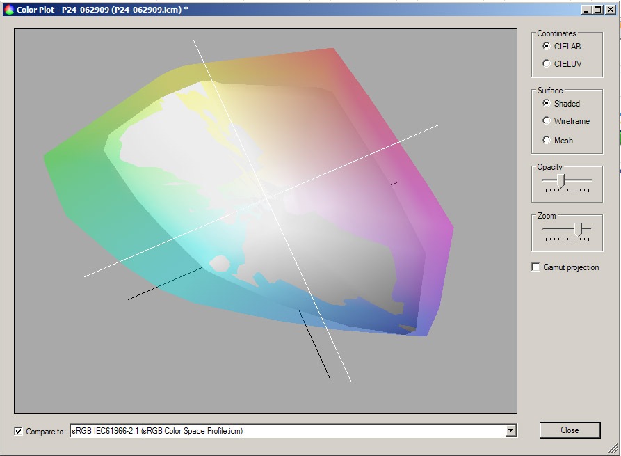 3. Vs. a calibrated Viewsonic VX2025 wm, VA panel (Philips 240PW9EB is much wider)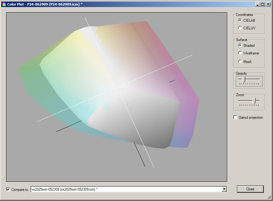 4. Vs. Japan Color 2001 Coated paper (Philips 240PW9EB is much wider)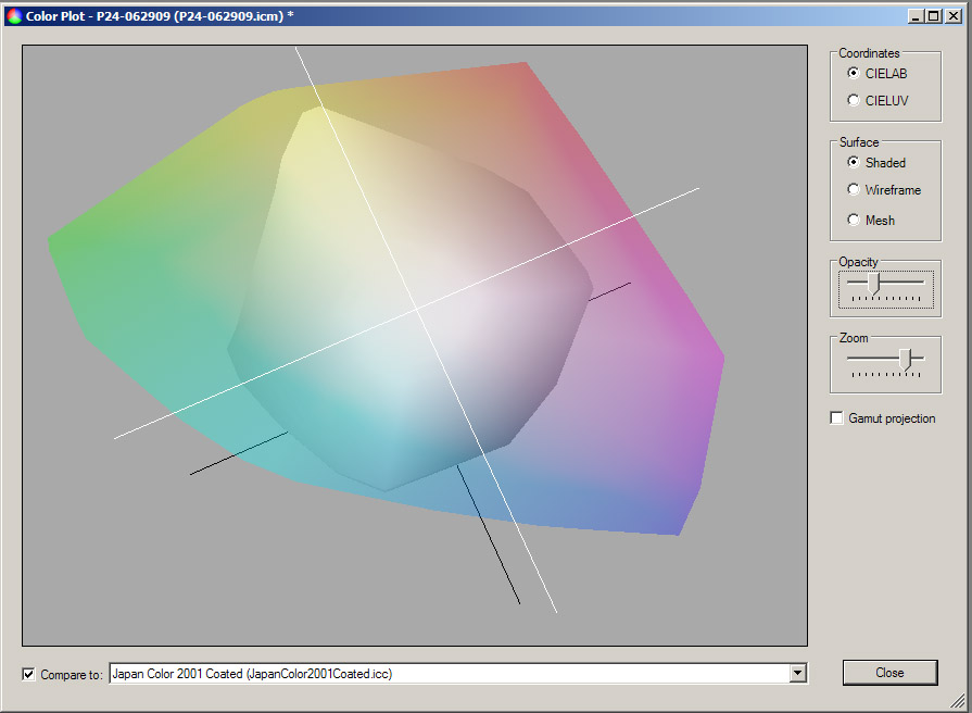 |
|
|
|
Post by Neon Rosell II on Jul 2, 2009 4:50:31 GMT
Wow!! Thanks Ka Mastah!! Now I can appreciate more how the gamut of various color space relates to a base line.
When you just say that the aRGB has a wider gamut I can't visualize it, but now, WOW!! no need to visualize it in my head, I can easily see it.
Another question, what's the reason for using aRGB in post processing then converting it to sRGB when presenting it in the web? Was there a big difference when just processing it in sRGB all the way? Thanks again.
Haven't touch my gears at all, I hope I don't need WD40 to un-seize the controls..hehehehe..been busy with my hives, need to manage it before it rains more.
|
|
|
|
Post by Romy Ocon on Jul 2, 2009 6:29:01 GMT
Another question, what's the reason for using aRGB in post processing then converting it to sRGB when presenting it in the web? Was there a big difference when just processing it in sRGB all the way? Thanks again. Very good question partner, and another sRGB vs aRBG graphical comparison is in order, so we can easily visualize the gamut difference (sRGB is the smaller area): 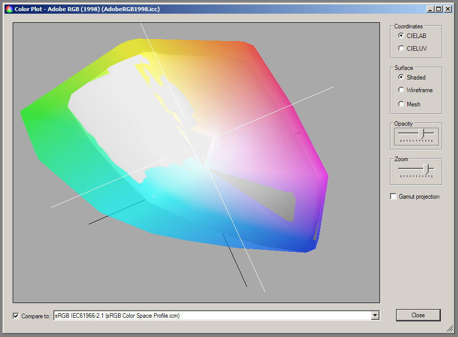 Now, let me try to answer your question based on my current best understanding of color gamuts and digital processing, with the caveat that I myself is a new student of this science and art, and I could very well be way off mark. First, like in all things digital, color representation is always done by numbers. When we convert a RAW photo into sRGB color space, and there are many colors that are out of sRGB's gamut, these out-of-gamut colors will be forced to be rounded off/converted into something that can be represented in the smaller color space. This has similar effect as rounding off many decimal places of a number into a few digits. Ex. - value of pi3.14159265358979323846264338327950288419716939937510...
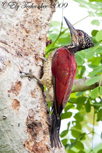
is rounded off to 3.1416 very early in the computation game, or right during RAW conversion. Now, when we do many processing routines on the converted TIFF or jpeg, this is similar to performing many complex operations using the rounded off value of pi. A cumulative rounding off error or inaccuracy results with each operation. If we convert from RAW to aRGB (or any wider gamut) instead of sRGB, it's as if we're using pi with more decimal places at the start, say 3.1415926, and succeeding compound operations will result into more accurate numbers at the end. After all number crunching (photo processing) is done, we can take the final number and this time round it off to 4 decimal places (convert to sRGB) for brevity with less loss of accuracy. Here's a Guaiabero with hot pinks and greens that I haven't been able to print well in many tries - the prints always turn out not up to my expectation when compared to what Pogito and I see on screen. This was processed in an all-sRGB workflow, from RAW to ready-for-printing file, and I think many of the hot greens and pinks lie outside the sRGB boundary.  And here's a quick version I did this morning (with Pogito helping in the WB), using a RAW-aRGB-processing-sRGB workflow. Note that I might have used a slightly different WB in this one from that used in the earlier all-sRGB version:  Pogito says that the greens and pinks are more accurate in the second version, and if he's correct, I'd attribute this to using aRGB in all processing, and converting to sRGB at the end. I might print this new version at JT, but I'll probably use the aRGB space (without conversion to sRGB), and I'll also ask them the ICC profiles of their ink/printer/paper so I can soft-proof in PS. Of course, it goes without saying that when the colors in the photo are all within sRGB space, then there's no point using a wider gamut. |
|


 , AFS 18-135mm f/3.5-5.6G , TC 1.4EII, TC 1.7EII, SB-800, Manfrotto 190CXPro3/393(3421), RRS BH-55, Kirk NC300 lens collar